Color is a powerful tool in transforming any interior space, setting the tone and mood to create a specific ambiance. Whether it’s calming neutrals or bold, vibrant hues, choosing the right paint color has a significant impact on how a room feels and functions. But with trends in interior paint colors shifting each year—often influenced by changes in fashion, lifestyle, and even psychology—it can be challenging to know where to start. This article aims to simplify the process by offering top tips on selecting what is a popular interior paint colors, helping you find shades that are both stylish and suited to your personal taste.
Tip 1: Understand Color Psychology
Color psychology explores how colors can influence mood, perception, and even behavior. Understanding the psychological effects of color can help you decide on the right tones for different spaces.
Blues: Known for its soothing properties, blue is a common choice for bedrooms and living rooms. Soft shades of blue can help create a relaxing space conducive to rest and unwinding.
Greens: Associated with nature, green promotes tranquility and relaxation, making it ideal for living rooms or kitchens where people gather to unwind or connect.
Neutrals: Shades like beige, gray, and off-white are timeless and versatile, making them among the most popular interior paint colors for a sophisticated, balanced look. Neutrals work well in almost any room, blending seamlessly with different furniture styles and decor.
Consider the purpose of each room before choosing a color. For a calming bedroom, softer shades like light blue or pastel green may be ideal. In contrast, energizing colors like yellow can work well in kitchens or dining areas where a lively ambiance is desirable.
Tip 2: Consider Lighting in the Room
Lighting plays a crucial role in how colors appear in a space, as natural and artificial light can change a color’s tone and brightness. This factor is essential when choosing what is a popular interior paint colors that will look great throughout the day.
Natural Light: In rooms with large windows or ample natural light, paint colors often appear lighter and more vibrant. South-facing rooms usually receive warm natural light, enhancing warmer tones, while north-facing rooms receive cooler natural light, which can make colors appear slightly darker or muted.
Artificial Light: The type of artificial lighting used can dramatically affect a color’s warmth or coolness. Warmer bulbs tend to enhance reds, yellows, and warm neutrals, while cooler lights make blues, greens, and grays stand out.
Test paint samples on your walls to observe how each color changes under different lighting throughout the day. This ensures that you select colors that stay true to your vision in various lighting conditions.
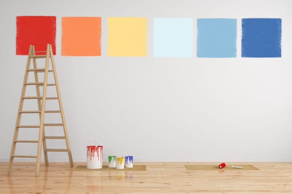
Tip 3: Research Current Color Trends
Interior paint trends change yearly, reflecting shifts in fashion, lifestyle, and broader cultural influences. Major paint brands release annual “Colors of the Year,” which often set the tone for what will be considered what is a popular interior paint colors. Staying updated on these trends can help you pick colors that are both stylish and likely to stay relevant.
Earthy Tones: Warm, grounded colors like terracotta, soft greens, and deep blues have gained popularity, inspired by a return to nature and simplicity.
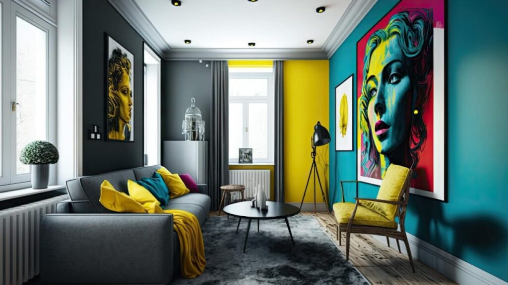
Vibrant Accents: Bold accents like coral, mustard yellow, and teal are used to add lively pops of color, perfect for feature walls or small spaces that need a touch of personality.
Explore trend announcements from popular paint brands like Sherwin-Williams, Benjamin Moore, and Behr. These brands often release seasonal palettes that showcase both timeless and trending colors, giving you insight into what’s popular and inspiring ideas that align with your tastes.
Tip 4: Balance with Existing Furniture and Decor
Wall colors should complement furnishings to create a cohesive look. For instance, bold wall colors can be overwhelming if the furniture is already vibrant, while too many neutrals may result in a flat and uninspired space. The goal is to create harmony, where colors enhance rather than clash with each other, resulting in a well-designed room.
Neutral Walls with Vibrant Furniture: Neutral wall colors, such as beige or soft gray, provide a calming backdrop that allows bolder furniture—such as a deep blue couch or mustard yellow chairs—to become the focal point, adding vibrancy without overwhelming the space.
Darker Tones with Light or Neutral Furnishings: For rooms with light or neutral-colored furniture, a darker wall color like charcoal or navy can add depth and contrast. This pairing works well in modern or minimalist designs, where darker tones make lighter pieces pop, emphasizing texture and shape.
Consider creating a mood board with paint swatches, fabric samples, and photos of your furniture to visualize how colors work together. Alternatively, many digital tools and apps allow you to upload photos of your room to test various color combinations virtually, which is a quick way to see how colors will complement your decor.
Tip 5: Test Colors Before Making a Decision
Testing paint colors before committing to a full room makeover can prevent costly mistakes and disappointment. Since lighting, furniture, and other elements can influence how colors appear, testing on-site ensures that you’re selecting what is a popular interior paint colors that looks good in the actual space. Colors often look different in sample photos or stores, so seeing them in your room can help you determine if they align with your expectations.
Paint Samples on Walls: Most paint brands offer small sample sizes, which allow you to apply patches of color directly on your walls. Painting a small area near furniture or in varying light exposure areas provides a realistic sense of how each color might look in your space.
Digital Visualization Tools: Many paint brands, including Sherwin-Williams and Behr, offer digital apps that allow you to upload photos of your room and “paint” walls virtually. This lets you try different colors and combinations without lifting a brush, helping you visualize your options quickly.
Encourage testing different shades within the same color family. Often, subtle differences in undertones (like warmer or cooler shades of gray) can significantly impact the look and feel of a room. Testing several shades lets you find the best fit for your space, ensuring that your choice will stay appealing over time.
In summary, choosing what is a popular interior paint colors involves understanding color psychology, considering lighting, staying informed on current trends, balancing with existing decor, and testing colors before committing.
For hands-on guidance, we invite you to visit Colour House Painting, where our expert team can provide paint samples and personalized advice to bring your vision to life. Whether you’re refreshing a single room or redesigning your entire home, our professionals are here to help you create a space you’ll love.


